Perspectives
Colour concept for the school campus with boarding school, Neustift im Stubaital, Tyrol, Austria.
Architecture: fasch&fuchs.architekten
Coulour concept: Gustav Deutsch, Hanna Schimek
Inspiration and guiding ideas
perspicere, Latin = to see through, see clearly
perpectiva (ars) = penetrating (artistic) vision
formal idiom = prospect for the future, way of regarding something
Aerial perspective >< colour perspective
Aerial perspective is a natural phenomenon in which atmospheric factors cause objects to appear lighter, lower contrast and less clear with increasing distance. Colour perspective is employed by painters to represent aerial perspective and generate a sense of depth.
Colour concept
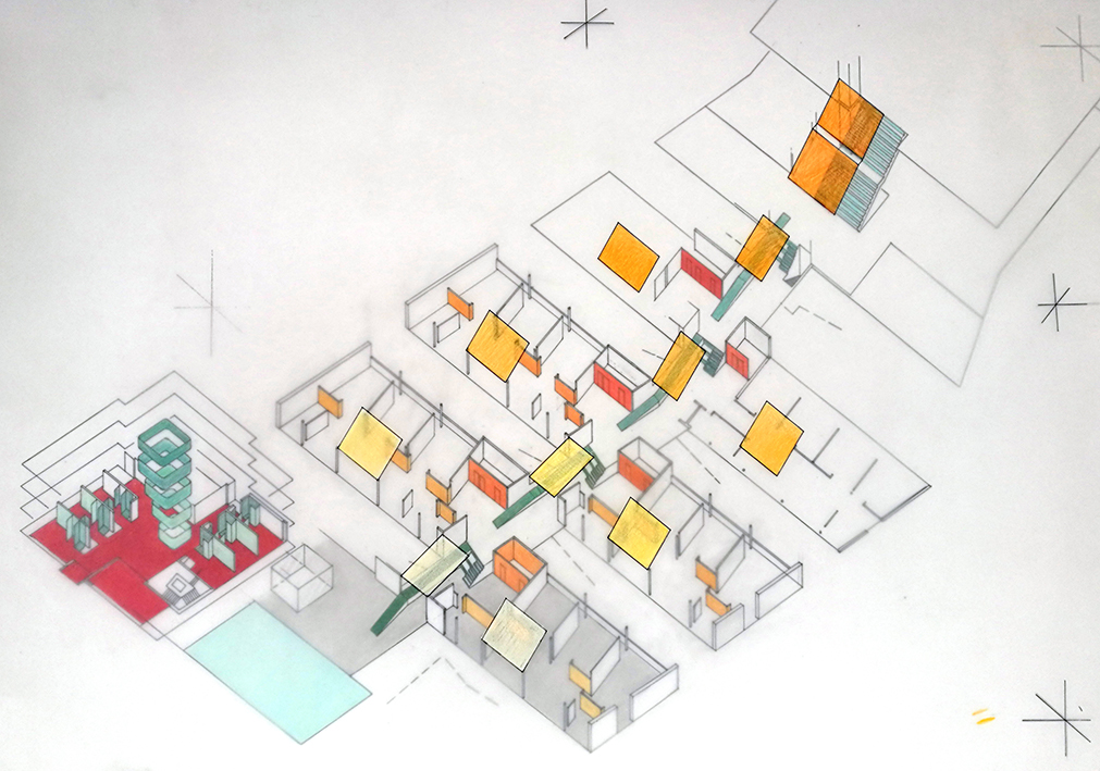
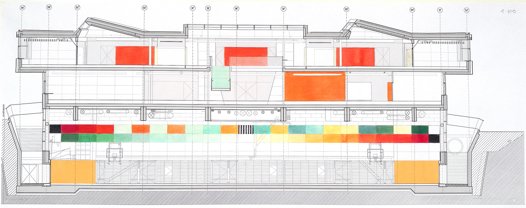
The local topographical situation – the position on a slope – as well as the architectural design – which takes advantage of this position and connects the individual buildings by means of a stairway and ramp resembling a village street – provide the basis for the selected title and for our concept’s utilisation of colour perspective, which is applied to all architectural elements (walls, stairs, ramps, ceilings, shed roofs, balustrades, doors, etc.).
Colour spectrum
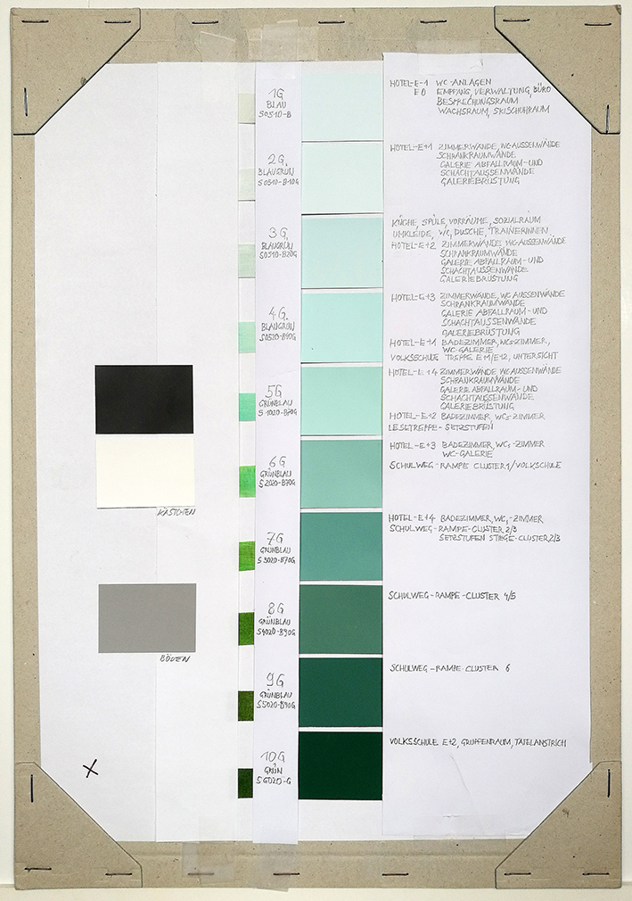
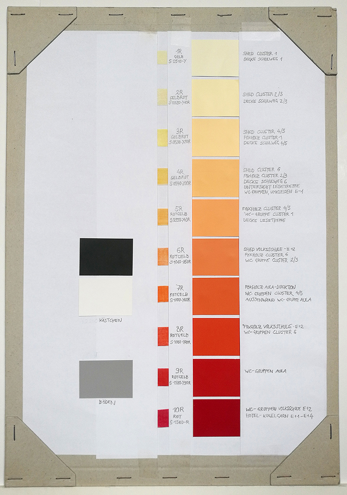
Here use is made of two 10-part colour spectra lying opposite one another on the colour wheel: green – blue and red – yellow, with pure colours at each pole of the spectra.
Floors
All floors (except in the boarding school, the refectory kitchen and the bathroom areas) are done in shades of grey, regardless of their materials. At the same time, the texture of the given material is to be kept. This means that a clear sealant will be applied to brushed screed, wooden floors will be varnished white and light gray, and prefabricated stair elements will be given a transparent coating. The texture of the wooden acoustic walls and doors which feature coloured varnishes, will also be kept.
Village street
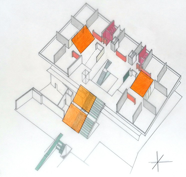
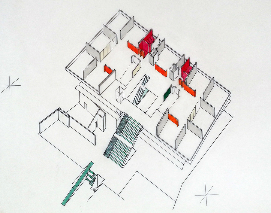
The stair risers of the stairways and the ramps of the village street are done in shades of green which, seen from below, become increasingly bluish as they progress up the slope. Conversely the ceilings (acoustic panels) above the stairs and ramps are done in shades of red-orange which, seen from above, become increasingly yellow as they descend. The same applies to the shed roofs in the clusters.
Cluster
The shades of red-orange on the walls leading from the village street into the clusters similarly become increasingly yellow from the top towards the bottom, while the wooden acoustic walls and doors are one grade darker and the walls and doors of the bathroom areas two grades darker than the shed roofs.
School hall and primary school
The same principle of red-orange-yellow colour perspective is also utilised for the walls in the school hall of the entrance level and for the walls, doors and shed roofs of the primary school.
Textiles
All of the textiles in the clusters and in the primary school (curtains, carpets and upholstery) are done in the green – blue palette. This is intended to establish an equilibrium in the colour temperatures and, in this way, in the atmosphere of the rooms.
Residential building
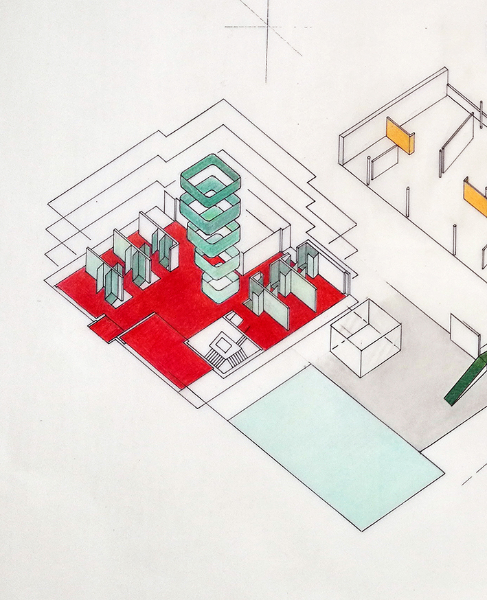
The principle of the cluster is inverted in the boarding school: All of the walls are done in the blue – green spectrum, becoming increasingly bold from the bottom to the top, that is, from the ground floor to the fourth floor. The walls of the bathroom areas in the rooms are always done one grade darker. All of the floors in the corridors and in the rooms are covered with Kugelgarn® carpeting in a bold shade of red-orange. The elegance and dignity of a hotel provides the model here.
Colour definition
All colours and all mixtures lying between them will be defined according to the Natural Colour System (NCS), in which a numerical code determines the exact mixture of blackness, colour intensity and the chromatic proportions among the colours. S 1050-Y90R, for example, means: 10% blackness, 50% chromaticness, 90% red in the yellow – red palette. The remaining 40% is the whiteness. With the help of this numerical code, the colour concept will be communicated to and carried out by everyone involved in carrying out the work.


