

moderate palette
Federal School Aspern, Aspern Seestadt, 1220 Vienna
Archtecture: fasch&fuchs architects
Colour concept: Gustav Deutsch, Hanna Schimek
www.mitfarbenlernen.com
About
Colours are of decisive importance for how we relate to the world:
they influence our psychological states: attentiveness, concentration, stimulation, fatigue
they display long-term effects: personality development, character
they define our environment and the world we live in: fashion, advertising, everyday culture
they thus play an important role in scholastic and personal education
Colours’ meanings and effects in schools:
they are functional means of communication: room functions, connections between rooms
they have a psychological effect: concentration, stimulation, relaxation
they fulfill a wayfinding function: emergency stairways, WC groups, cloakrooms
they are teaching aids: art education, perception of colour, sensitivity to colour, colour systems
The colour concept for a school must therefore take psychological and educational aspects into account alongside purely aesthetic, artistic/architectural criteria.
Accordingly, colours are not selected and assigned arbitrarily, but arrived at on the basis of rules and principles derived from these criteria and aspects.
The colour design of a school building becomes complete only through its users:
through the colours that the students and teachers bring into the building with their clothing and accessories and through the colours of the subject matter, objects and materials needed for instruction – books, posters, teaching aids.
Palette of colours
Large-scale building units of the Federal School in Aspern will be done in a moderate and reserved
palette featuring unsaturated colours. The complete effect will unfold only in combination with bold
colours.
Bold accents of colours
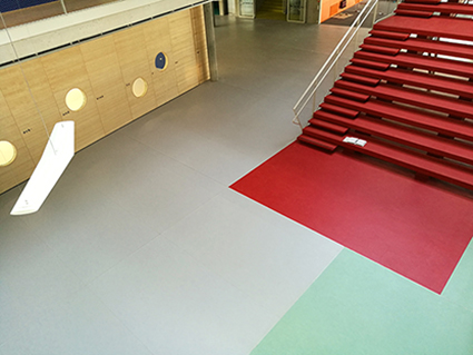
Bold accents of colour will be applied to a few architectural components or groups of rooms with
a specific significance and also to individual, mobile elements: these will serve to provide orientation
and to light up the moderate palette. Walls in the school hall and in the entrance areas, staircases,
wardrobes, kitchen cafeteria, bathroom units, mats.
Selection of colours
All colours applied to surfaces at the factory or on site (walls, metal structures, wooden structures) will
be selected and mixed based on the Natural Colour System (NCS).
For all other surfaces utilising a predefined material/ palette (laminate board, flooring, textiles, artificial
leather), the colours will be based as closely as possible on the intended shade.
Colour identity and assignment
The same functions and areas (departments, clusters, gymnasiums, etc.) will be assigned the same floor colours.
In keeping with the school’s new teaching concepts and organisational forms, the floor colours will be extended beyond the boundaries of the rooms. In this way, the colours incorporate corridors, lounge areas and recreation areas and combine them into larger units.
According to the given function of the areas (activity, educational, recreational, etc. areas), the floor colours will be selected from either a cold (green – turquoise – blue) or warm (yellow – orange – red) spectrum.
The colours of vertical surfaces (pinboards, blinds, curtains) and furniture will be selected from and associated with the opposite spectrum. This complementary use of colour (cold/warm) is based on the notion that rooms associated with both colour spectra provide an opportunity for psychological
equilibrium (concentration – relaxation).
Selection of colours for floors and walls / bold accents
Individual functional areas will be provided with a signal and wayfinding function through the use of
intense colours: emergency stairways, cloak rooms, kitchen refectory, WC groups, bathroom areas. In
these cases, the colours will be applied uniformly across all horizontal and vertical surfaces, in order
to achieve the effect and impression of autonomous and bold islands of colour.
Colour and material
Colour will be added to all surfaces in keeping with their specific material quality, so that their surface textures are preserved and not covered by layers of paint foreign to the material. Wooden surfaces will be varnished or oiled, the wood’s texture will remain visible Plasterboard walls will be plastered over and painted white. Exposed concrete surfaces will remain untreated, with the exception of bathroom areas. Steel structures and sheet metal will be coated with enamel or galvanised.


